Today’s blog post about Japanese Fabric is about the Sketch Series by Kayo Aoyama.
I went to check out her Instagram account – kayoaoyama and immediately fell in love! She not only designs fabrics, but also product packaging and other accessories.

Kayo Aoyama also has a website – Kayoaoyama.com where you can see a full range of her fabrics and designs. Her designs are inspired by organic shapes, mostly derived from objects of nature like plants and stones. But what I love most about her designs are how she combines them with such amazing colour palettes.
I’m primarily a pastel palette lover, so immediately, these two fabrics jumped out at me.

This is called flying cups, and the pink is a little lighter in real life. But the unique thing about this fabric, is that it is made of a special fabric called typewriter fabric. It was my first time coming across this type of fabric and initially I thought it must have been some kind of translation error, but no, it is called typewriter fabric and it seems to be a Japanese term for this type of fabric because if you tried to Google in English you just get lots of fabrics with actual typewriters printed on them 😂.
If you search タイプライター (for typewriter) and 生地 (for fabric) in Japanese or in Rakuten, you will get a whole bunch of the correct results. So from what I gathered, it is thin, very smooth, densely woven, 100% cotton fabric. And when I finally had the chance to touch it, I was so impressed, I wanted to make bedsheets out of it. Because it really reminded me of Egyptian cotton. It was smooth and cool to touch and you can barely see the weave of the fabric.
There’s a better explanation from this Japanese website that I found, and it’s quite a long explanation so just an excerpt
Type typewriter fabric is a long and thin cotton yarn woven with high density. Because the fibers are densely woven, it is a material that can be said to be a representative of functional fabrics that are durable but also lightweight and warmth retained.
If you are interested to know more, click on the link above and use Google translate to read it. It’s really interesting!

This double gauze fabric is called forget me not and is super soft and the color is really pretty too! Will be lovely for a little girl’s dress! Doesn’t the flower motif remind you of a particular monogram label? 😉

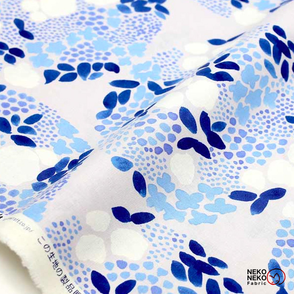
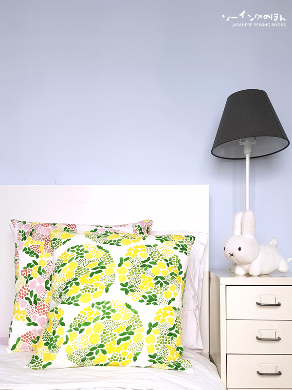
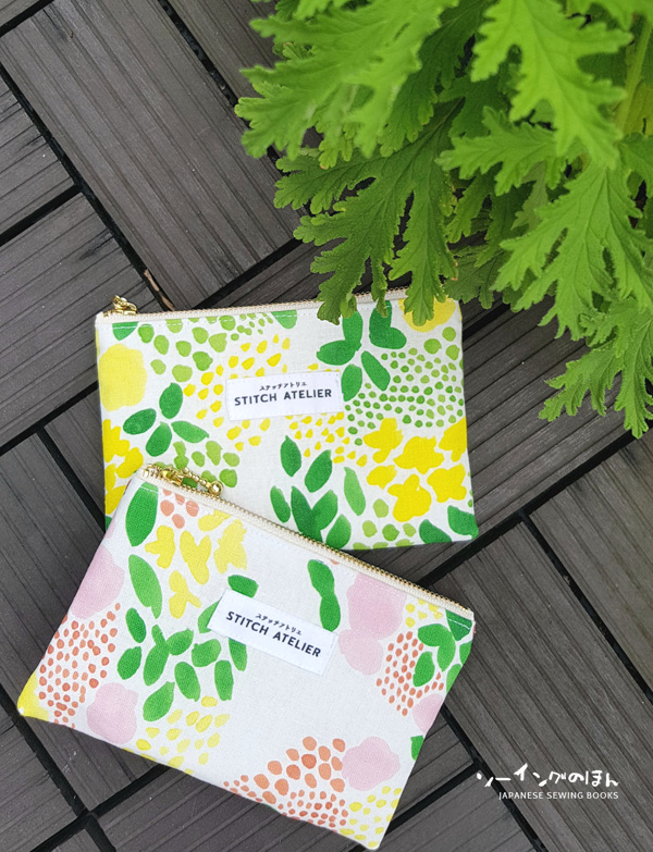
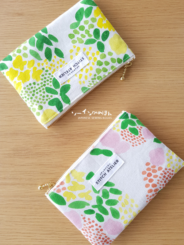
The other one I wanted to show you is the flower ball print. Made up of large clusters of watercolor flower prints, this design is a soft canvas and comes in 3 colorways. I really liked the blue one but in the end I chose the other two colorways because I wanted to make a matching set and the greens in both colorways matched perfectly.

Needed some new cushions for my new place and these really brightened up the room!

Made 2 card holder pouches. I only needed one but I thought having two will make the photo look much better!

In Kayo Aoyama’s website, she says
My design is inspired by organic shapes, like plants and stones. I draw by hand, because the uneven lines or trace of brush makes reminds me the most of nature.
My wish is that my design will brighten up your everyday life the same way a fresh bouquet of flowers will add that extra sparkle to your home.
I think she really has achieved it hasn’t she?


